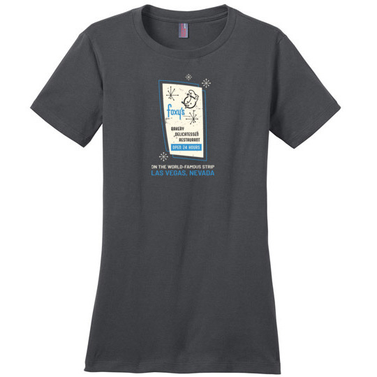
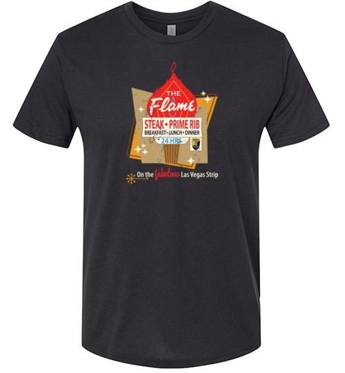
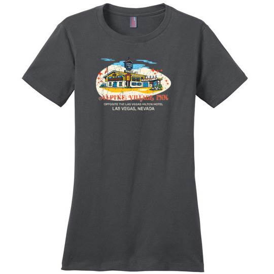
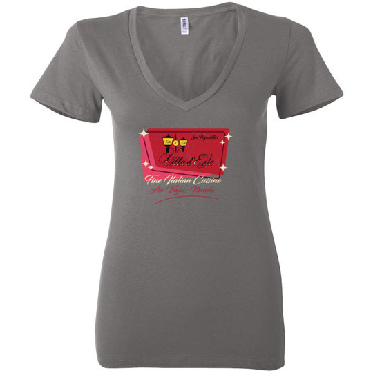
Decoding the Decades: A Look at Vintage Las Vegas Logos & Their History
The Rise of the Neon Brand
Before the mega-resorts and celebrity headliners, Las Vegas built its reputation on a potent mix of gambling, entertainment, and, crucially, branding. The early years, from the 1930s onward, saw a deliberate effort to create a visual identity – a “look” – that screamed excitement and possibility. These weren’t just logos; they were promises of escapism, luxury, and a taste of the high life. Early casinos like the El Rancho Vegas and the Flamingo understood that a distinctive logo, boldly displayed on signage and promotional materials, was essential for attracting customers from across the country.
Iconic Designs Reflecting the Era
Think about the designs of that era. They weren’t subtle. They were big, bold, and often screamed for attention in the desert landscape. The Riviera’s swirling, stylized “R” captured the international flair popular in the 1950s. The Stardust’s celestial imagery spoke to the romance and mystery that casinos aimed to evoke. The Desert Inn, with its art deco influences, symbolized the streamlined sophistication of the mid-century. The MGM Grand’s lion logo, first appearing in 1963, became instantly recognizable and remains iconic today, evolving but always retaining its regal presence. These weren’t just random artistic choices; they were carefully considered representations of the casinos’ desired image. They often drew from architectural styles, popular culture, and a general sense of optimism and grandeur.
The Evolution of Casino Identity
The 1960s and 70s saw further refinements. The Circus Circus logo, featuring a playful clown, targeted a wider family audience. The Golden Nugget, capitalizing on its gold rush theme, employed evocative imagery of prospectors and old West elements. As Vegas expanded – the Las Vegas Strip became increasingly congested and competitive – logos became even more elaborate and ambitious, incorporating increasingly complex typography and graphics. The proliferation of neon signs became a defining feature of the Las Vegas skyline, with these logos shining brightly as beacons of entertainment and fortune. The fonts used were often custom-designed, further solidifying the uniqueness of each casino’s brand.
Legacy and Lasting Influence
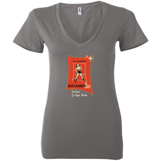
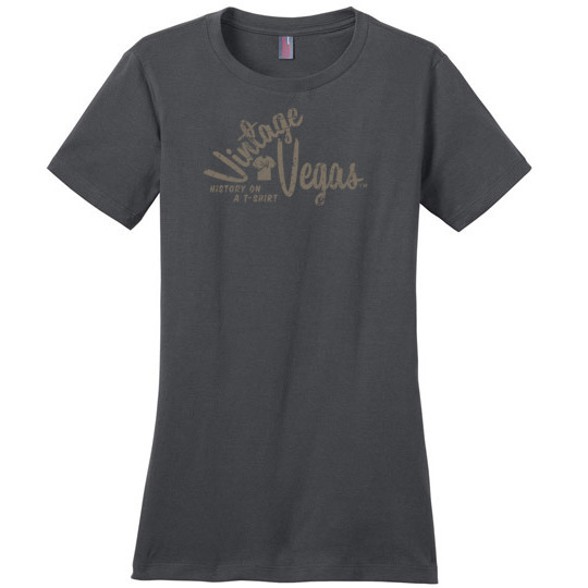
These vintage Vegas logos continue to hold a powerful allure. They represent a simpler, yet arguably more exciting, era of Las Vegas – one where the focus was on spectacle and the promise of a thrilling experience. They’re a tangible link to the city’s unique history, reminding us of the visionaries who built Vegas into the entertainment capital of the world. Today, we at Vintage Vegas Shirts are proud to celebrate this legacy, recreating these iconic designs on our shirts, preserving a vital piece of Las Vegas history for generations to come. The faded colors, the slightly distressed feel – it’s all about capturing that authentic vintage vibe, a nostalgic trip back to the Golden Age of Las Vegas.